

Design a Social Graphic That Survives Cropping
A graphic can look balanced on the editing canvas and become unreadable when displayed as a small preview or cropped on another platform. This checklist helps you design for the final placement, not only for the editor window.
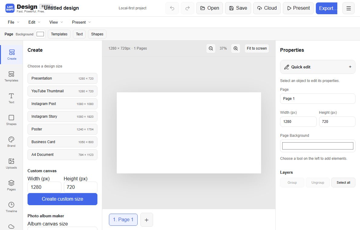
Start with the destination dimensions
Choose the required aspect ratio before placing photos or text. Square, landscape and vertical placements do not share one perfect crop. Make separate variants if your graphic must appear in very different layouts.
Give essential content a safe zone
Keep the headline, logo and call-to-action away from the outer edge. A platform's UI overlays or automatic crops can hide corner content. Check with the actual target preview rather than relying on a universal margin percentage.
Make the message readable at thumbnail size
Use a clear hierarchy: one main message, one supporting line and restrained decoration. Check contrast and test at the small size where most people will first encounter the graphic.
Export and re-open the real file
Inspect PNG or JPG at full size and thumbnail size. Watch for blurry text, missing fonts, unexpected transparency or color shifts. Keep an editable source so you can produce later variants.